Walk Score had recently released a scoring system for cycling in collaboration with researchers from Cycling in Cities, a University of British Columbia research program. A number of American and Canadian cities now have scores, including Toronto.
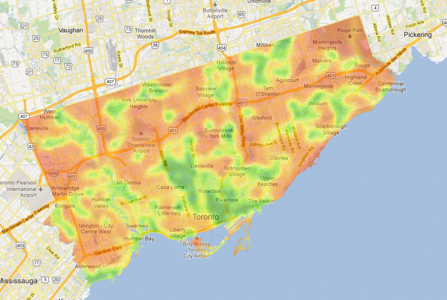
There is something odd going on with Toronto. The places where the highest percentages of commuters use bicycles also have a high chance of being areas with low Bike Scores. I overlayed a map of the bicycle mode share across Toronto from Statistics Canada. The following is just the bike commuter mode share:

I then tried to merge the two in the following image. Where bike mode share is high but the Bike Score is poor it shows up as purplish. Where bike mode share is high and the Bike Score is good it shows up as bluish-green.
 cnaComparing Bike Score to Mode Share in Toronto
Why do Torontonians bike despite a poor Bike Score?
There are three possible explanations. Bike Score is trying to measure whether a location is "good for biking" and not necessarily correlate with high bike mode shares. Bike Score might be missing, or not giving enough weight to, some factors that make Toronto neighbourhoods bike-friendly. Or Bike Score data is inaccurate and misses some key bike infrastructure. I think it's a combination of the three.
Bike Score will never match perfectly with mode share. It appears that averaged across a city that there is a strong correlation of mode share and Bike Score. Yet this isn't true for areas of Toronto. Bike Score actually takes into account bike commuting mode share when coming up with the measure. An obvious way to increase the match would be to give mode share a higher weighting. But make it too high and it just becomes a a mode share measure and not one of "bikeability".
Bike Score is based on the Cycling in Cities research, which included these environmental factors important to cyclists:
- cycling infrastructure (separated bike lanes and bike paths, local street bikeways, painted bike lanes)
- topography (hilliness)
- desirable amenities (grocery stores, restaurants, schools, etc.) and road connectivity (both are components of Walk Score, which was used to capture these elements within Bike Score)
There seems to be missing data. In the Trinity Bellwoods area, for example, the mode share is one of the highest in the city, yet the Bike Score is quite poor. Part of this breakdown may be due to what seems to be missing College and Harbord bike lanes (there doesn't appear to be a green smudge where they are). These are two of the best used bike lanes in the city. Bike Score should get more accurate data from the City of Toronto.
Aside from these omissions there still seems to be disconnect so let's speculate on other factors that influence high bike mode share. One factor is destination (distance to desirable amenities and road connectivity). They include destination as a heat map and it appears to match bike mode share more closely than their overall Bike Score. Should they give destination more weighting?
Another factor is the friendliness of residential streets. While the main arteries of Toronto seldom have bike lanes, the residential streets provide respite for the speed and chaos of traffic. Local street bikeways are included but unlike other cities like Vancouver Toronto residential streets often don't have any bike-specific features yet can still be bikeable.
Another factor is cultural influence. Cycling rates have increased in Toronto at a much higher rate than the increase in cycling infrastructure. In areas where people can see "ordinary" women and men of all ages cycling, it becomes much easier for other people to see themselves as cycling as well. Since Bike Score already incorporates a mode share component it appears as if either this data is missing for Toronto or they might need to give it a higher weighting. As Bike Score says, "We believe as more people in your social network bike, there's a stronger chance that you will bike."
Since Bike Score is in beta it will inevitably improve by adding more accurate data and perhaps changing the weighting of items over time. I look forward to seeing how it will develop and be used by researchers, business and government.
Comments
Pothen (not verified)
The bikescore "heat map" also
Fri, 05/25/2012 - 15:11The bikescore "heat map" also seems to omit the bike lane along Cosburn Avenue, north of Danforth. That bike lane runs all the way from Gledhill (near main) to Broadview. That accounts for the wierd "doughnut" shape of the bike-friendly zone depicted in Woodine Heights and Old East York.
Pothen (not verified)
ANOTHER issue: BikeScore's
Fri, 05/25/2012 - 15:13ANOTHER issue: BikeScore's map seems to be missing the bike lanes down Landsdowne and Roncesvalles.
Kevin (not verified)
I note that the BikeScore map
Tue, 05/29/2012 - 22:43I note that the BikeScore map gives a relatively poor rating to the car-free Toronto Islands community. That seems to be a rather spectacular failure of the BikeScore algorithm. Did its US designers simply not consider car-free communities?
Anne (not verified)
I was just looking at Bike
Wed, 05/30/2012 - 14:21I was just looking at Bike Score this morning for both Chicago and Toronto. Last week I was doing a fair amount of riding in TO, mostly on major streets in/near downtown and the Harbourfront. Overall it was one of the easiest cycling experiences I've had anywhere. The Trinity Bellwoods area was an absolute delight. I noticed on the Bike Score map that a chunk in the middle of Queens Quay was poorly rated, yet I found it an extremely easy ride and saw a steady stream of cyclists there for much of the day, so mode share isn't an issue.
Here in Chicago, where I'm familiar with more neighborhood streets, I was very disappointed that Bike Score didn't seem to give any weighting to favorable conditions on residential streets. They obviously gave a heavier weighting to mode share, even though many of the heavily used commutes really aren't very bike friendly (high dooring risk and many curb cuts/intersecting, creating many conflict points). They didn't seem to give much weighting to neighborhood small business districts, even though some of them attract a lot of bike traffic.
This makes me more than a little skeptical of their model, which doesn't accurately reflect on-the-street experiences. The model appears to rely in official statistics and what's on a map rather than any amount of familiarity and local knowledge.