Makes so much sense it would will never happen here.

Arlene Clement, one of the Dandies behind Dandyhorse has announced that the second issue of Dandyhorse magazine has hit the presses, and will be officially released at the launch party of Wednesday April 29th. Read on for the details!
dandyhorse Launch Party!
The Spring 2009 issue of dandyhorse has hit the presses, and we're celebrating with a launch party on April 29th!
Date: Wednesday April 29, 2009
Time: 7:00 pm – midnight
Location: Amsterdam Brewery – 21 Bathurst Street (south of Front St., at Fort York Blvd.)The party, sponsored by Amsterdam’s new brew, Big Wheel Deluxe Amber, will have DJs, cash bar, gold sprints, and more!
PLUS: silent auction of original art by John Englar, made out of the original boards from the human powered rollercoaster, with treatment of misfit bike parts.
$5 at the door, includes magazine.
Free admission for contributors and subscribers, including bike union members (who will be receiving their issue in the mail!)
Everyone welcome - please feel free to forward this invitation to others.
Visit dandyhorse on the web at: www.dandyhorse.com
vic : 16 years 2 months ago
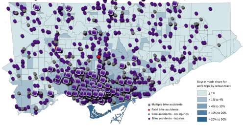
This is a third look at the Bike Modal Share of Toronto. In this map I layered the Bike Accident map from Patrick Cain's Toronto Star blog on top of the Census 2006 bicycle modal share in Toronto. By graphically I mean that I just took the two images rotated them until they lined up and prettied them up. Not very sophisticated but the results speak for themselves.
We had reported before on the bike accident map, and Darren_S made the good point that it wasn't very useful without a reference point to traffic patterns:
In some respects the map is rather superficial. If we overlay cyclists traffic patterns, would we not expect to see the number of accidents as shown in this map? So if we compared trips to the number of accidents would we come up with a different map? ie., if the overall average collision rate is 1 (a number I made up for simplicity) for every thousand trips, we should see many more collisions on College St (high cycling use) when compared to Birchmount (low cycling use) when we look at the number of collisions for each -yet percentage wise they are the same. When the collision rate falls outside the average for a particular street then it becomes a concern.
I think that the map better describes cyclists traffic patterns rather than any problem areas. It shows us where resources should be spent on improving conditions for cyclists, Bloor/Danforth, Queen and Yonge are high on the list, simply because this is where they are riding.
I believe that this map provides a bit more relevance. Even though downtown looks like a pretty dangerous place when taking accidents on their own, if we take into account the 10 to 20 fold difference in cycling commuting numbers it doesn't look all that bad.
What the map still doesn't tell us is what area is the most dangerous. For that we'd have to have access to the numbers and try to correlate on a finer scale the number of accidents to absolute number of bike commuters. I wonder if the City staff are working on it? You'd think it would be somewhat useful for finding out what areas to improve.
herb : 16 years 2 months ago
- ‹ previous
- Page 244
- next ›